Take Two Bakery
every bite deserves a second take
|
every bite deserves a second take |
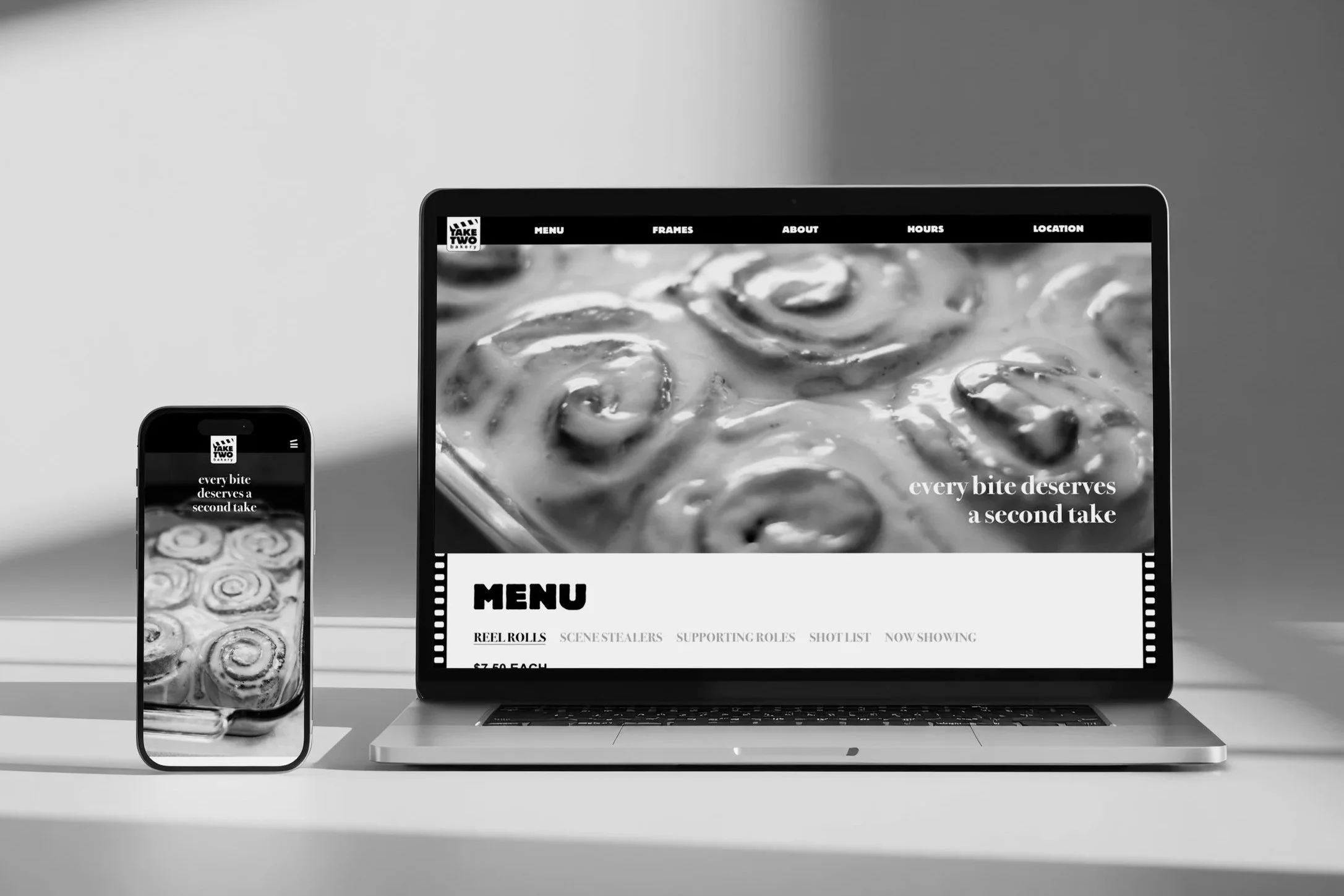
Take Two Bakery is a cinematic-inspired neighborhood bake shop where every detail is crafted to perfection because every bite is worth a second take. Blending the artistry of film with the comfort of fresh baking, our menu stars its signature “Reel Rolls” alongside a rotating cast of pastries, espresso drinks, and weekly features. With a playful nod to movie culture and a focus on high-quality, handcrafted ingredients, Take Two Bakery invites guests to slow down, indulge, and come back for an encore.
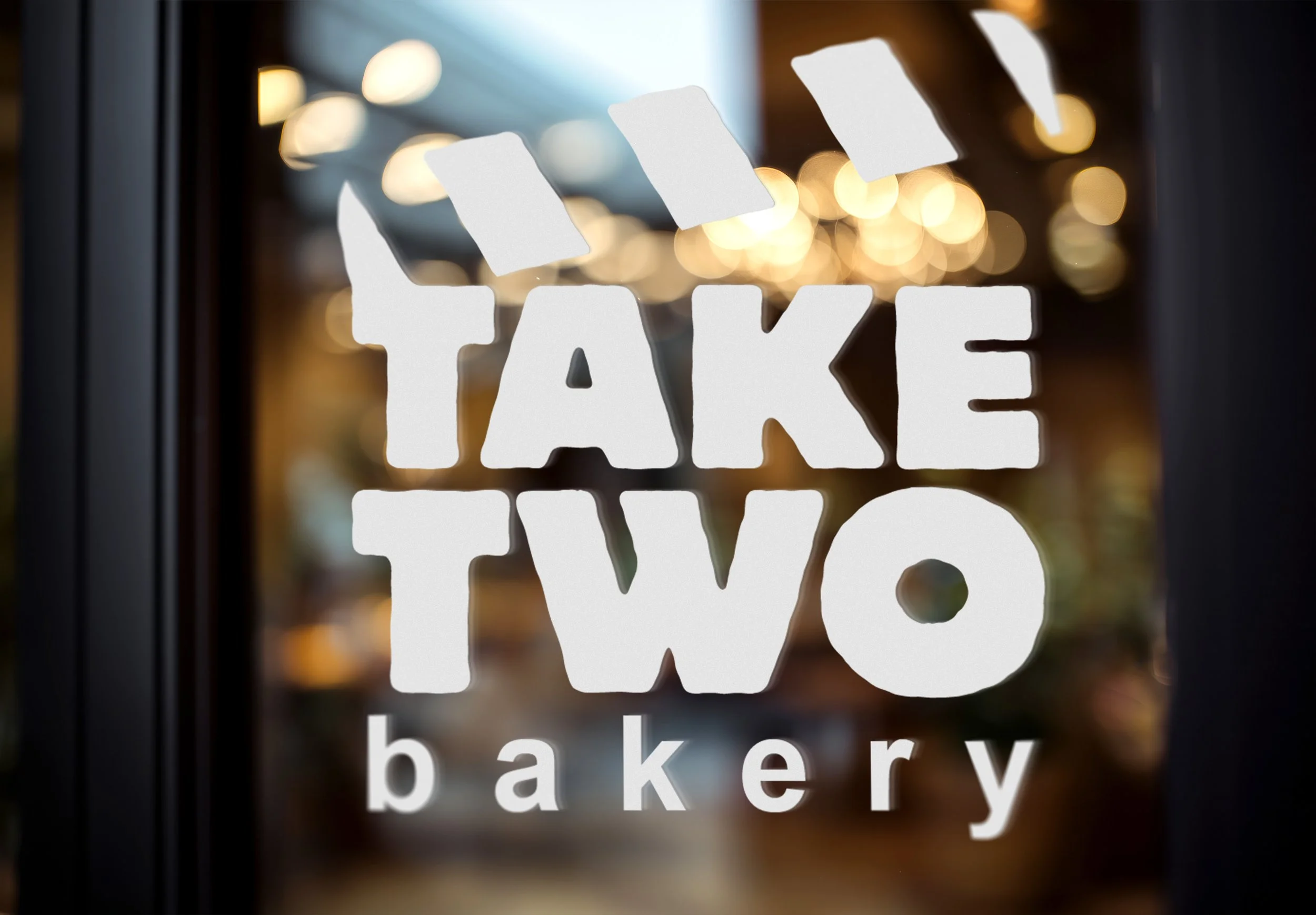
Logo
The Take Two Bakery logo was designed to reference a clapperboard, the iconic filmmaking tool used to sync audio and visuals while marking scenes throughout the editing process. I incorporated a bold, structured typeface to mirror the geometric shape of the board itself, while the striped clapper stick inspired the logo’s visual rhythm and contrast. To further connect the logo cinematic authenticity, I used Arial for the word “bakery,” referencing the simple sans-serif typography commonly found on real clapperboards to display scene numbers, dates, takes, and other production details. The clapperboard logo ties together the bakery’s film-inspired identity with a recognizable symbol of storytelling and production, making the brand instantly memorable and visually cohesive.
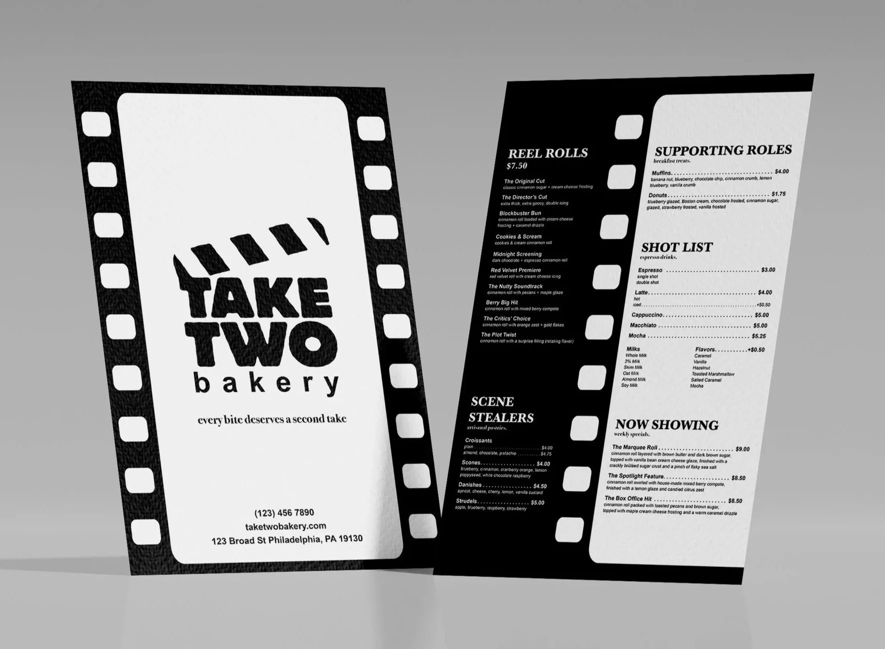
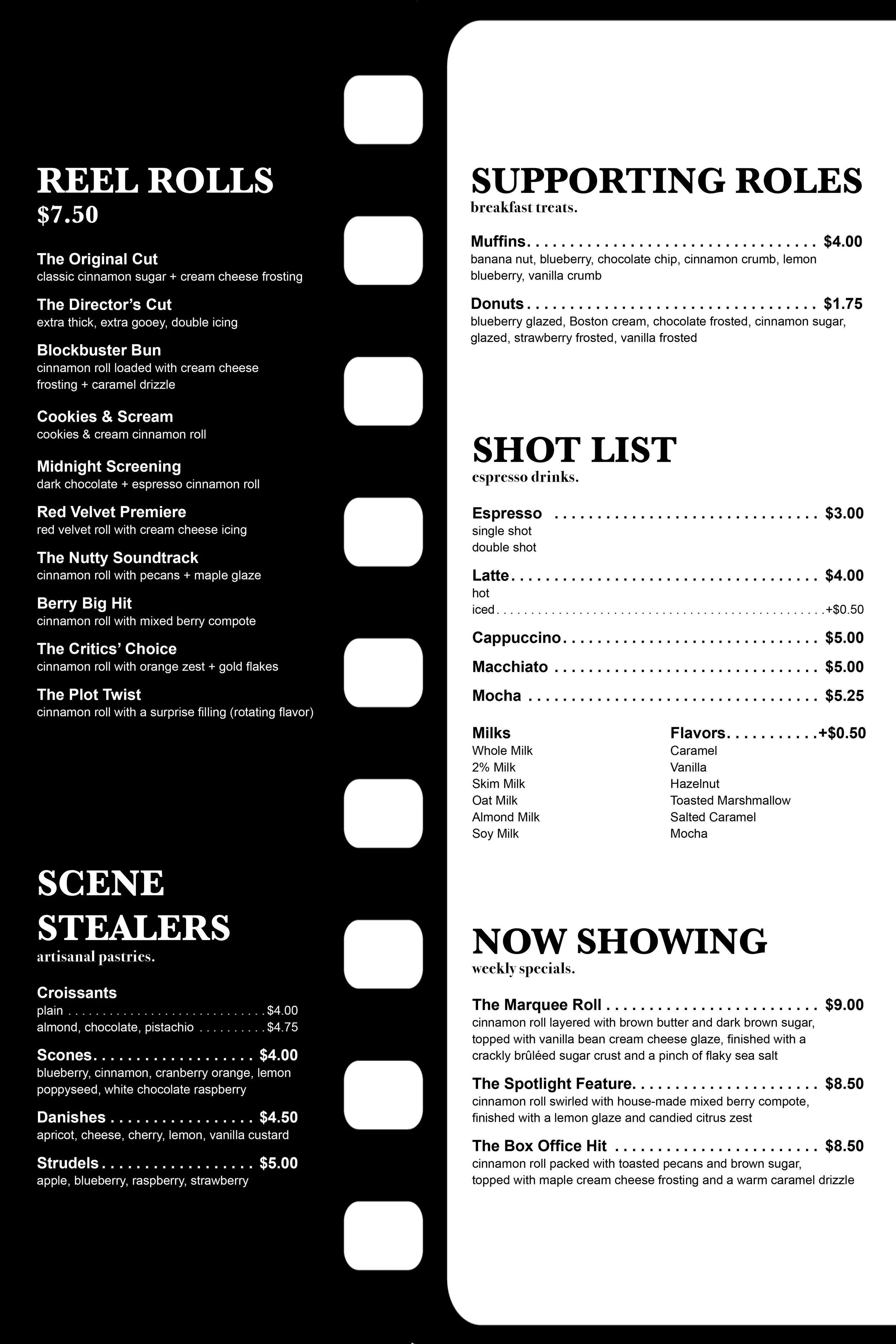
Menu
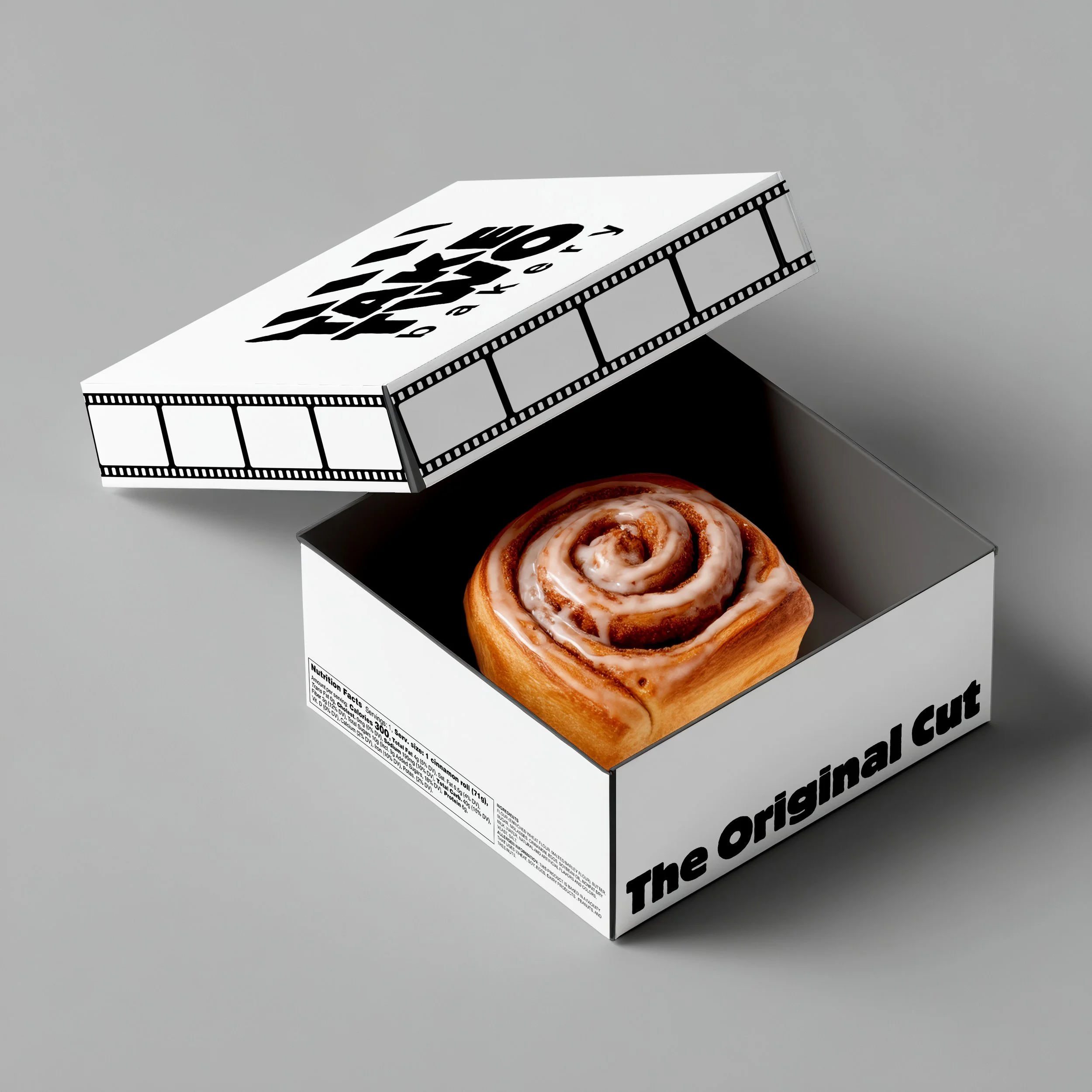
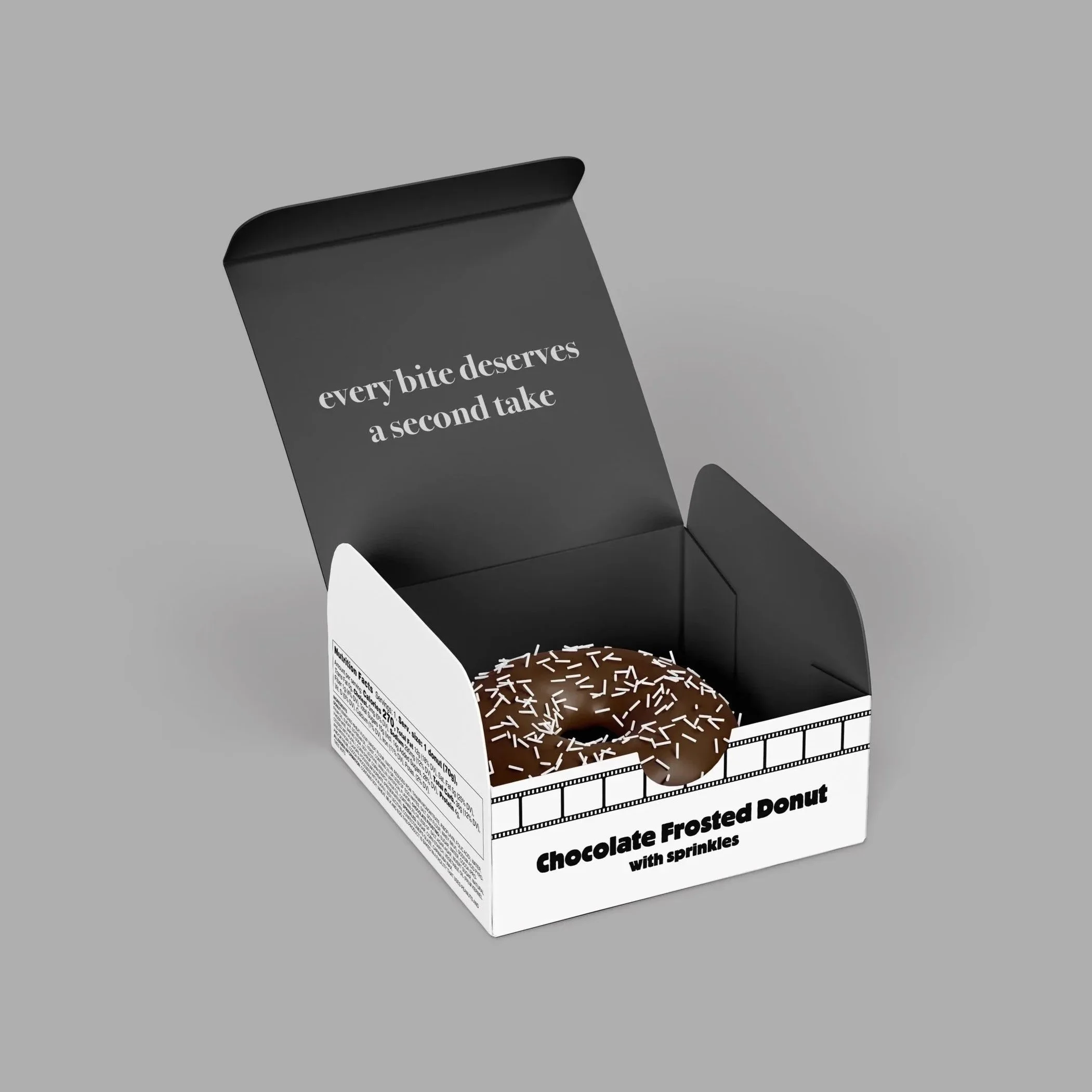
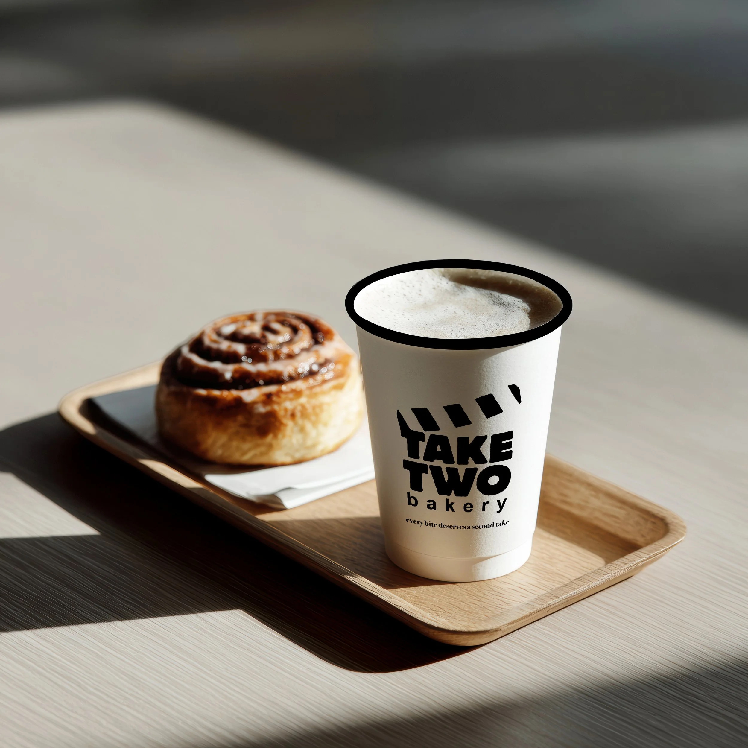
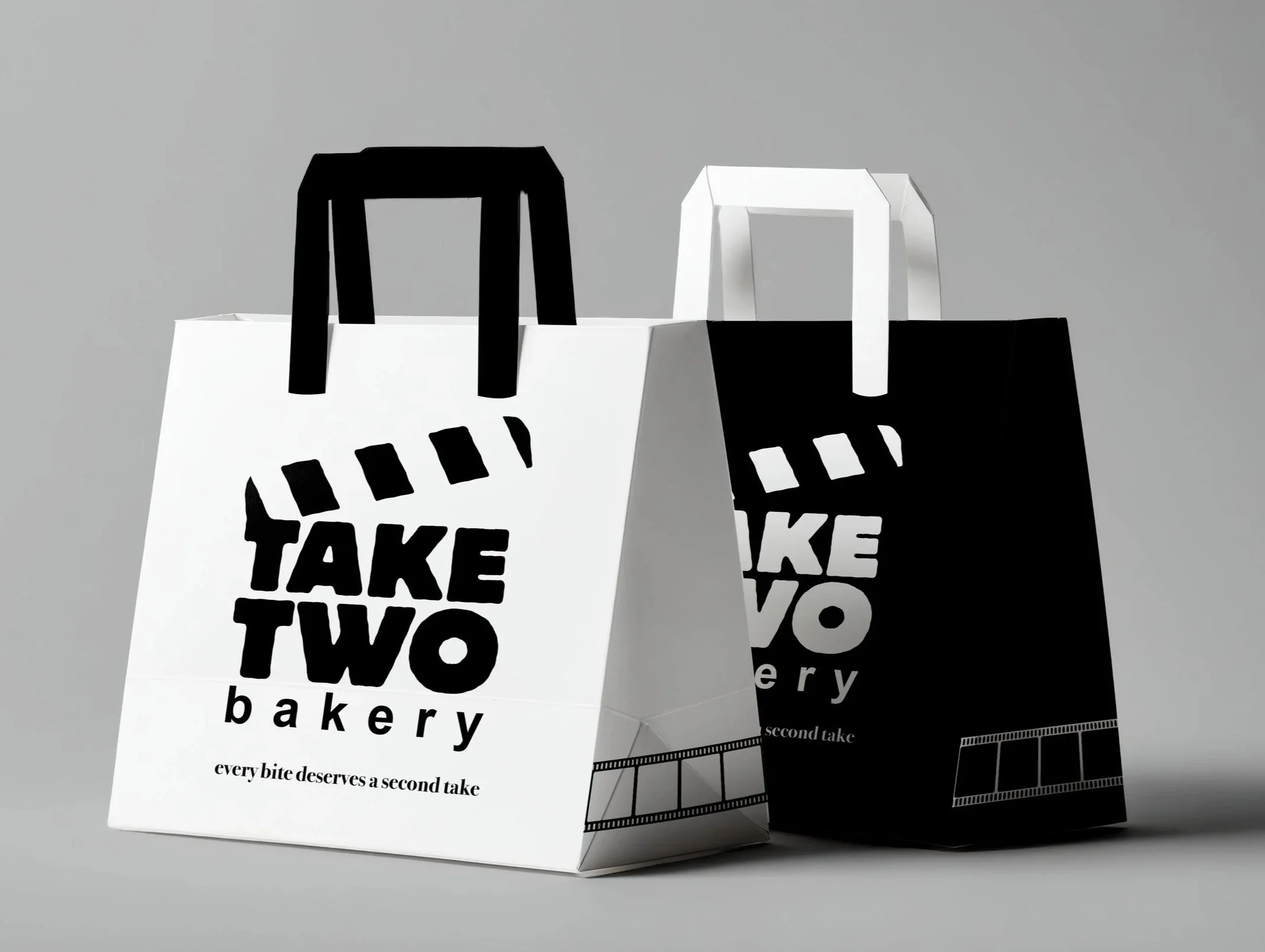
Packaging
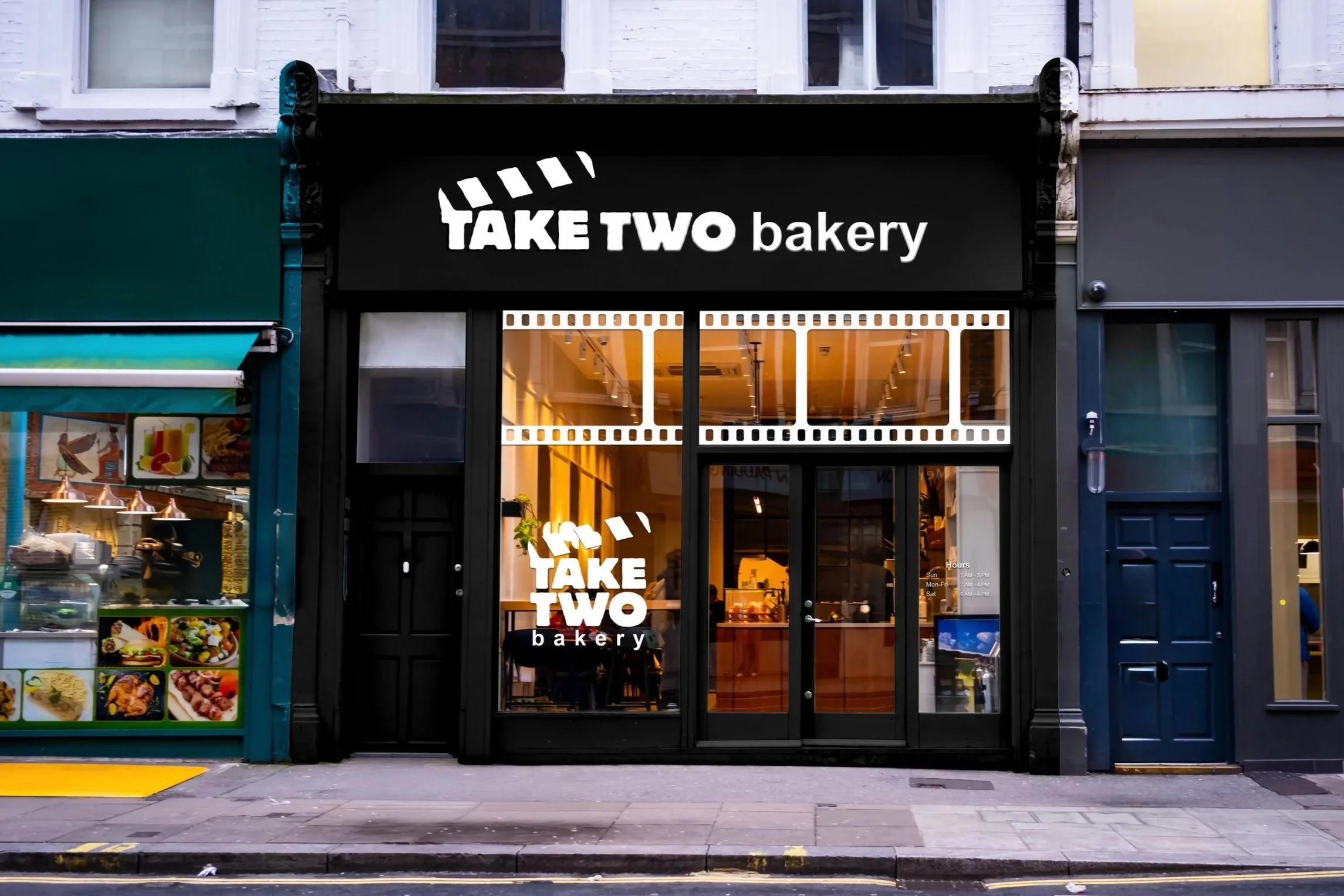
Storefront & Signage
Website